"Like it or not, we live in a superficial world. How you look and how you dress is taken as a representation of your self.".. yada yada..
hmmmm... interesting...
so i continue reading on.. anxious to see how ugly these uniforms are.. and then i see..
10. Newcastle United FC (home)
Jersey lifespan: 1894-present
The creator of the Newcastle United jersey didn't have a very colorful imagination; his gray thinking turned out a uniform that alternates between thick black and white stripes.
It's unclear whether he was inspired by the outfits of early 1900s jailbirds, hockey and football referees, or simply zebras. Whatever the case, none of these are really prime images to be affiliated with.
WHAT THE HECKK!!!!!!!!!!!!!! CRAZY OR WHATT!!!!!!!!!!!!!!!!!!!!. o my goodness. this guy who wrote the article is a plain IDIOT. how the hell can it be UGLY?!?! it's not biasness or anything but i seriously think the black and white is damn cool. this is called classic, and it's more than a design.. it's come to be a kinda symbol of the immense passion that is the football of newcastle. and THIS IDIOT COMES ALONG WITH SOME STUPID JAILBIRD INTERPRETATION?!?!?!!
BLIND. damn bad taste.
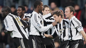
i mean.. u're calling THIS ugly?!?!
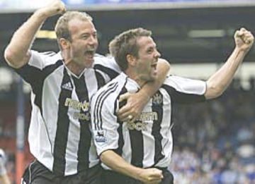
OR THIS?!?!
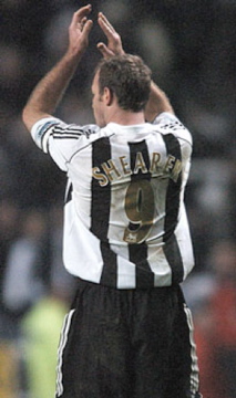
AND THE WORST THING IS... you're calling THISSSSS UGLY!?!?!
grrrr... what a blind doofus.
No comments:
Post a Comment